Speculative Design
Branding
Fall 2023, Adobe Illustrator
The Brief:
I was tasked to create a speculative product, and then create the branding for said brand. A lot of stuff had be be made, such as a website, business cards, stationary, etc.
Conceptualization:
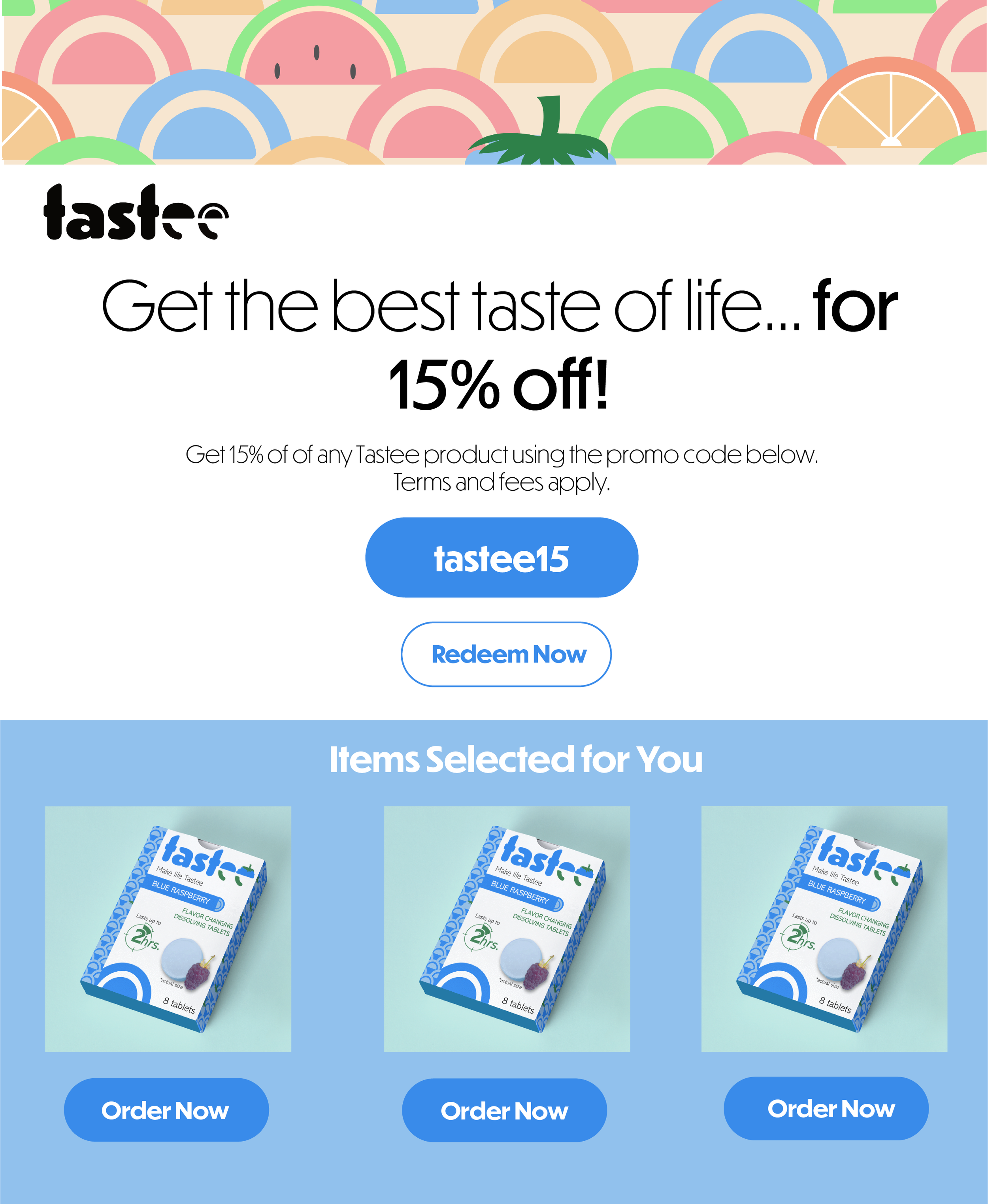
I had come up with a brand called “Tastee”, which was a brand of tablets that dissolved in your mouth, and once it was fully dissolved, it would make whatever you eat for the next two hours taste like the flavor of tablet that you had ingested, I decided to make my target audience people who had dietary restrictions, as they may have to eat things that they don’t care too much for due to these restrictions. With this, Tastee was going to have to be branded as more of a healthcare product, and so I wanted the branding to be more fun. I wanted Tastee to still have a healthcare look to it, while also making it more fun and colorful than your average healthcare brand.
Execution:
I had started with the logo of Tastee, and I had made two different ones: The first logo that I had created was a wordmark, and I had made different versions of this wordmark logo to represent each of the flavors of Tastee that I had created. For each of these logos, I wanted the colors to represent the color of the flavor, as well as have the top of the last “e” be an icon of said flavor. With this idea in mind, I came up with the black logo, that was to be used on designs that didn’t pertain to a particular flavor, and that was where I came up with the icon that would be on top on the last “e”, which is the semi circle and the arch above it. I decided to take this part of the wordmark logo, and use it as not only its own logo, but also as a design element throughout the branding. I had also created a pattern to be used on the packaging of Tastee, and on other elements of the brand as well. For packaging, I created different patterns that represented the flavor that it pertained to (see packaging mockup), and for anything that didn’t pertain to a specific flavor (see business card and email ad), I had created a pattern that represented all of the flavors in one.