
Innervision/Mindflex Logo
Logos
Spring 2022, Adobe Illustrator
The Brief:
I was approached by the company EP!C, a n organization for adults with disabilities based in Peoria, Illinois. They were working on a new branch for their company, that was either going to be named either InnverVision or MindFlex, and it was going to be a therapy service for their patients that was meant to feel comforting and homely. They did not want it to have the look or feel of a hospital or healthcare service, and they did not want it to look too closely tied with EP!C, as they did not want people to automatically associate the two and then not find comfort in a company that was supposed to bring comfort to its patients.
Conceptualization:
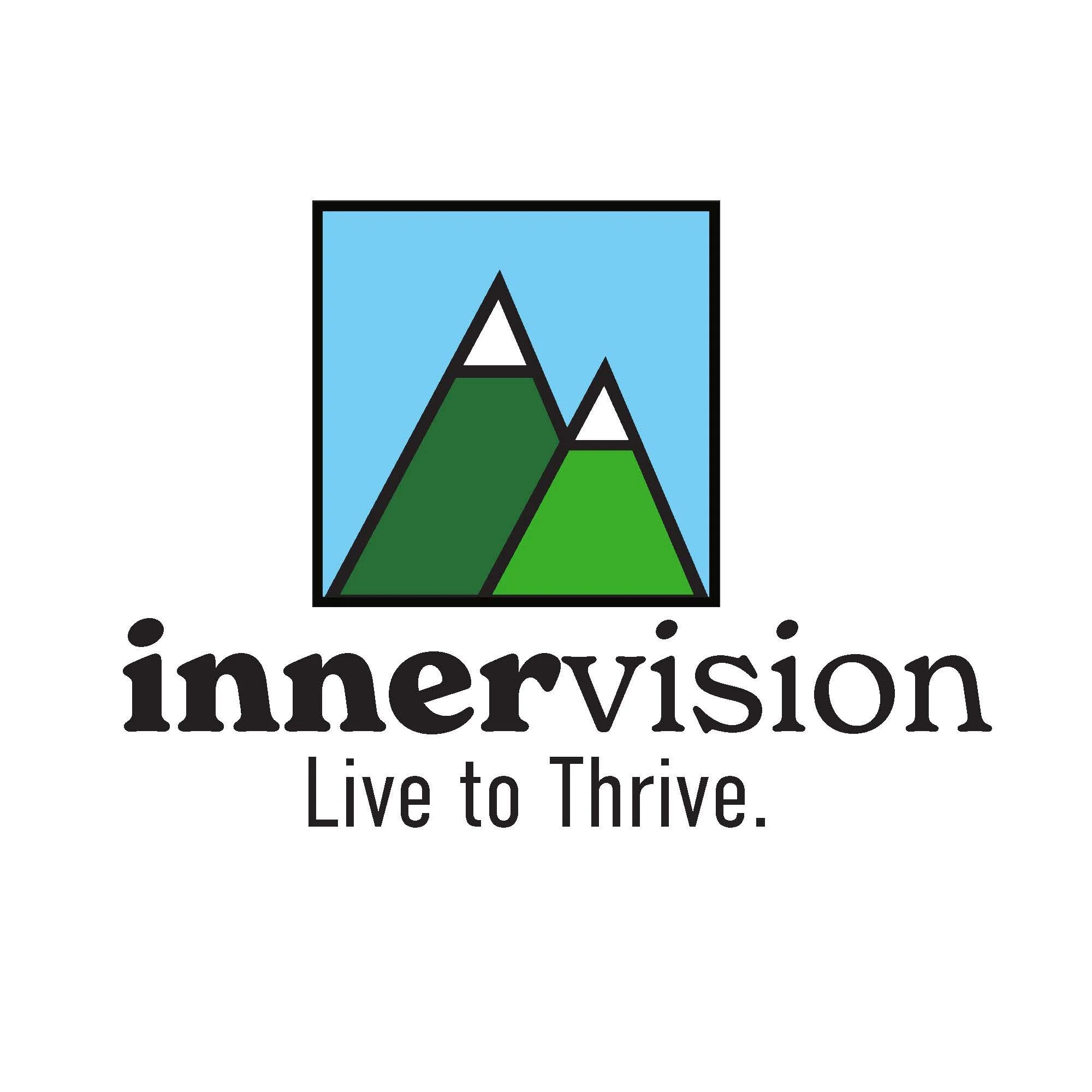
I wanted to create logos that had a nostalgic feel to them, as people find comfort in nostalgia. Specifically for the InnerVision logo, I took inspiration from the Goodwill logo, and how it had bold, black outlines on it in order to provide a nostalgic, comforting feeling.
Execution:
I used the same fonts for both the InnerVision and the MindFlex logos: New Spirit for the name, and Abadi MT for the slogan. I decided to use New Spirit for the name, as it’s a font that not only has a nostalgic feel to it, but it also has an approachability to it that you don’t realy get with other serif fonts. I think that’s probably thanks to the fact that the serifs in New Spirit are very round and soft, which makes it more comforting and versatile.
For the InnerVision logo, I created an illustration of mountains, as it served for two purposes: to play into the “Vision” part of the name, as mountains are a very visual experience, and I also wanted to create a metaphor for living with disability, as it can feel like climbing up a mountain, but it’s incredibly rewarding when you reach the top. I also used blue and green to tie into EP!C’s brand color palette, but I used different shades of them in order to make InnerVision still feel like it was a separate entity from EP!C.
For the MindFlex logo, I wanted to create a logo that played into the “Flex” part of the name. I decided to create a logo that had 5 lines, one for each new service that the MindFlex program would offer, and I made them “flex” into the shape of an M (for MindFlex, of course). I also used the color orange, as it was one of the secondary brand colors of EP!C that they don’t use on their logo, so I thought it would be a great way to still give the logo the EP!C touch, while also making it so that it wasn’t too visually related to the company.